X
HGG Community Forums
Log In to HorseGeneticsGame
HGG Community Forums
Join our discord server!
Howdy, Stranger!
It looks like you're new here. If you want to get involved, click one of these buttons!
Categories
- All Discussions9,494
- Announcements691
- HAJ Discussion8,506
- ↳ New Member Introductions28
- ↳ Help Me Out943
- ↳ Horses for Sale and Auction2,708
- ↳ Breeding Ads and Sales1,058
- ↳ Herd Helpers1,941
- ↳ Bug Discussion8
- ↳ Repair Log0
- General Discussion297
- ↳ Saddle Sisterhood16
- ↳ Games, Contests and Giveaways104
- ↳ Genetics65
In this Discussion
- Ammit September 2023
- DarkPhoenix September 2023
- OneSaltyMitch September 2023
- RamshornRanch September 2023
- SummerMonarch September 2023
- Walywoohoo September 2023
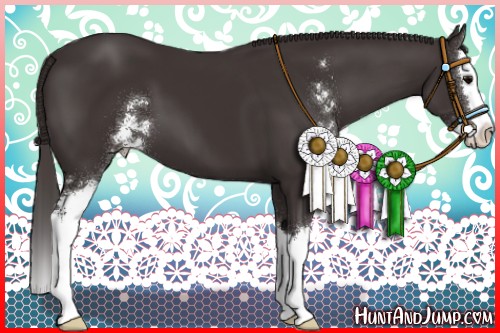
I did a thing.
-
I'm a little rusty at this but I thought it looked pretty good. What do you think?

OSM Commanders Rayge FF ID #: 9524
Home of Crème Brûlée and Fantasy Warmbloods and Drafts -
very cute! :xNeed to contact me? Read this first.
I sometimes get busy and miss things. If your private message, question, etc. gets missed please ping me so I can follow up with you. I am also always happy to explain or clarify. (HAJ does not have a customer service email, please send me a forum message! )
she/herThanked by 1OneSaltyMitch -
It looks amazing! I love it!DarkPhoenix #15470 (she/her) ~ Premium Upgrade
Barns always open!Thanked by 1OneSaltyMitch -
If I may make one suggestion the color of your text would be easier to read if the color contrasted better with the stallion's dark coat. I love everything else about it!Ramshorn Ranch
Formerly Ramshorn Sport Horses
ID# 12824Thanked by 1OneSaltyMitch -
I absolutely welcome suggestions. :) You're definitely right. The black that goes across his stockings is okay, but his name does blend in with his coat much more than I would like. Perhaps a nice lighter shade of blue so it doesn't blend into my background as well?ID #: 9524

Home of Crème Brûlée and Fantasy Warmbloods and Drafts -
ID #: 9524

Home of Crème Brûlée and Fantasy Warmbloods and Drafts -
On Commander Rayge I wonder if you could try to match the text to the strands of green that appear in the upper left corner of the background. I think tying it into matching the background, but still allowing it to stand out would look nice.
I love the background of the bright red trees in the second one you posted for Dust in the Wind.Ramshorn Ranch
Formerly Ramshorn Sport Horses
ID# 12824Thanked by 1OneSaltyMitch -
What you really need for legibility is either a stroke or a drop shadow.Need to contact me? Read this first.
I sometimes get busy and miss things. If your private message, question, etc. gets missed please ping me so I can follow up with you. I am also always happy to explain or clarify. (HAJ does not have a customer service email, please send me a forum message! )
she/herThanked by 1OneSaltyMitch -
@RamshornSportHorses, oh, I bet that would look nice. I'll give it a try.
@Ammit, I definitely do need a drop shadow. I'm just not completely certain how to from my Kindle yet. I need to mess around with it a bit more.
I appreciate the feedback! :)ID #: 9524
Home of Crème Brûlée and Fantasy Warmbloods and Drafts -
ooo, I’m loving these! I think that if you were to do a little shading, it would really help define the bodies a little more. The lineart is really faint on dust in the wind and the head and legs are blending into the body. Totally up to you though. :)
If I may ask, what program do you use? I’m one of those IbisPaintX finger drawers lol =))DarkPhoenix #15470 (she/her) ~ Premium Upgrade
Barns always open! -
I'm using kleki. It's a very light, browser based version of Gimp (more or less). It's nice because I can use it on my Kindle rather than having to get on my PC to do anything.ID #: 9524

Home of Crème Brûlée and Fantasy Warmbloods and Drafts -
Ohhh, I used to use Kleki but it glitched so much for me. It's improved a lot since two years ago. I'm thinking of getting Procreate soon but I'm a little broke haha.DarkPhoenix #15470 (she/her) ~ Premium Upgrade
Barns always open!


